Responsive UX design is a crucial aspect of modern web development and user experience optimization. In today’s digital age, where users access websites and applications on various devices with different screen sizes and resolutions, creating a responsive user experience is paramount for success.
In this comprehensive guide, we will enter the world of responsive UX design, exploring its importance, key principles, best practices, and the top 10 jobs in the field.
Understanding Responsive UX Design
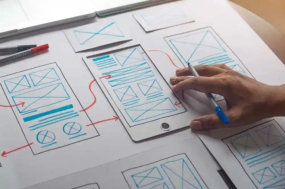
Responsive UX design refers to the practice of creating digital experiences that adapt and respond to different screen sizes and devices. It involves designing websites and applications in a way that ensures optimal viewing and interaction across a wide range of devices, from desktop computers to smartphones and tablets.
A responsive design approach focuses on providing a seamless and consistent user experience regardless of the device being used.
Importance of Responsive UX Design
The importance of responsive UX design cannot be overstated in today’s mobile-first world. With the increasing use of smartphones and tablets for browsing the internet, users expect websites and applications to be accessible and easy to use on any device.
A responsive design not only enhances user experience but also contributes to improved search engine rankings, as search engines like Google prioritize mobile-friendly websites in their search results.
Key Principles of Responsive UX Design
In today’s multi-device world, creating a responsive user experience is essential to meet the diverse needs of users. Responsive UX design ensures that digital products adapt seamlessly to various screen sizes and devices, delivering a consistent and enjoyable experience. The following principles highlight key strategies for achieving effective responsive design.
- Mobile-First Approach: Start the design process with mobile devices in mind, ensuring that the user experience is optimized for smaller screens.
- Fluid Grid Layouts: Use fluid grid layouts that adjust to different screen sizes, providing a consistent design across devices.
- Flexible Images and Media: Employ flexible images and media that can adapt to the size of the viewport without losing quality or functionality.
- Media Queries: Utilize CSS media queries to apply different styles based on the device’s screen size and orientation.
- Touch-Friendly Design: Design interactive elements to be touch-friendly, considering the gestures and behaviors of mobile users.
Best Practices for Responsive UX Design
Creating a responsive user experience goes beyond technical adjustments—it’s about prioritising usability, performance, and accessibility. By following these best practices, designers can ensure that their digital products deliver a seamless and inclusive experience across all devices and screen sizes.
- Prioritize Content: Focus on delivering essential content first and then enhance the experience with additional features for larger screens.
- Optimize Performance: Ensure fast loading times by optimizing images, scripts, and other resources for different devices.
- User Testing: Conduct thorough user testing on various devices to identify and address any usability issues.
- Consistent Experience: Maintain a consistent visual design and user interface elements across different devices to create a cohesive experience.
- Accessibility: Design with accessibility in mind, making sure that all users, including those with disabilities, can interact with the interface effectively.
Top 10 Jobs in Responsive UX Design
Responsive UX design offers a wide range of career opportunities for professionals passionate about creating adaptable and user-friendly digital experiences. From crafting intuitive interfaces to managing content strategies, these roles are essential for meeting the demands of today’s multi-device users.
- UX Designer: Responsible for creating intuitive and user-friendly experiences across multiple devices.
- UI Designer: Focuses on designing the visual elements and interactive features of websites and applications.
- Front-End Developer: Implements the design elements using HTML, CSS, and JavaScript to ensure a seamless user experience.
- Web Developer: Builds and maintains websites with a focus on responsive design and user experience.
- Interaction Designer: Designs interactive experiences that engage users and enhance usability on different devices.
- Mobile App Designer: Specializes in creating mobile applications with a strong emphasis on responsive design principles.
- Usability Analyst: Conducts usability testing and research to optimize the user experience across various devices.
- Information Architect: Organizes and structures content to improve navigation and findability on responsive websites.
- Content Strategist: Develops strategies for creating and delivering content that resonates with users on different devices.
- Digital Product Manager: Oversees the development and optimization of digital products with a focus on responsive UX design.
Conclusion
In the competitive landscape of digital design and development, mastering responsive UX design is essential for creating engaging and effective user experiences. By following best practices, staying updated on industry trends, and honing your skills in responsive design, you can position yourself for success in a variety of rewarding careers in the field.
Key Takeaways:
- Responsive UX design plays a pivotal role in modern web development and user experience optimization, catering to users accessing websites across various devices.
- Understanding the importance of responsive design, key principles like a mobile-first approach, fluid grid layouts, and touch-friendly design are crucial for creating seamless user experiences.
- Best practices such as prioritizing content, optimizing performance, and ensuring accessibility contribute to a consistent and engaging user experience.
- The top 10 jobs in responsive UX design offer diverse opportunities for professionals seeking rewarding careers in digital design and development.
For those looking to deepen their knowledge and skills in responsive UX design, consider enrolling in the Parson’s UX Design Foundations online course and certificate program.
This comprehensive program will equip you with the necessary expertise to excel in the dynamic field of responsive UX design and pursue a successful career in the digital realm.